How to Optimize Your Website for Mobile Speed and UX
- Leadraft SEO
- Jun 20, 2025
- 6 min read


In a world where smartphones have become the primary gateway to the internet, your website's mobile experience isn't just important — it's essential. More than 60% of all web traffic now comes from mobile devices, and that number is only growing. If your site doesn't load quickly or offer a smooth experience on phones and tablets, you're likely missing out on traffic, leads, and conversions.
Mobile optimization has evolved from a nice-to-have to a must-have. Speed and user experience (UX) are the two pillars of success when it comes to mobile performance. Google’s mobile-first indexing only makes this clearer: if your mobile site fails, your entire online presence suffers. For businesses focused on digital marketing in Vizag, mastering mobile speed and UX isn’t optional — it’s mission-critical.
Whether you're a small business, a content creator, or partnering with a digital marketing company in Vizag, this blog will walk you through everything you need to know to improve your mobile performance for both users and search engines.
The Impact of Mobile on SEO and User Behavior
Let’s begin by understanding how deeply mobile usage affects online behavior. When users visit a website on their phones, they expect fast-loading pages, clean navigation, and content that’s easy to read without pinching and zooming. If your site fails to meet those expectations, they bounce — and probably don’t return.
Google understands this shift in behavior, which is why it prioritizes mobile usability in its ranking algorithm. It’s not just about design aesthetics. Speed, responsiveness, load time, usability, and content hierarchy all contribute to your site's search visibility.
When you're investing in digital marketing in Vizag, you're not just investing in visibility — you're investing in trust. And in the mobile era, trust begins with experience.
Streamlining Mobile Site Speed
Speed is the first impression your website makes. A slow-loading mobile site turns away users before they even interact with your content. Studies show that 1 in 2 users will leave a mobile page that takes longer than 3 seconds to load.
Mobile site speed optimization begins at the server level. Choosing fast, secure hosting makes a significant difference. Next, ensure that your website’s code is lightweight. Minimize JavaScript, compress CSS, and eliminate render-blocking resources. These are not just developer tasks—they're growth strategies.
Images are often the biggest culprits in slowing down mobile websites. Instead of large, uncompressed JPEGs, use modern formats like WebP and apply compression without sacrificing quality. Also, consider enabling lazy loading so that images load only when the user scrolls down.
Another element often overlooked is the use of a content delivery network (CDN). A CDN caches your content across multiple servers worldwide, allowing your site to load from the location nearest to the user. This reduces latency and improves load time.
PageSpeed Insights, GTmetrix, and Lighthouse are free tools that can help diagnose slow-loading elements and offer solutions tailored to your site.
Designing with Mobile UX in Mind
Speed brings users to your site, but UX is what keeps them there. UX (user experience) on mobile is entirely different from desktop. On smaller screens, every decision — from layout to navigation — needs to prioritize ease of use.
One of the foundational principles of good mobile UX is simplicity. Simplify the user interface. Minimize the number of clicks it takes to perform an action. Use a single-column layout so content doesn’t feel cramped. Keep the focus on what matters most: readability, clarity, and conversion.
Menus should be intuitive. A collapsible hamburger menu is commonly used, but even that should be refined. Ensure that buttons are large enough to tap, that they don’t overlap, and that they don’t force the user to zoom in. Text should be legible without squinting or scrolling sideways.
The ideal mobile UX also supports intuitive gestures. Users expect to swipe, tap, and scroll with ease. Make sure forms are easy to fill out. Reduce the number of fields, use auto-complete where possible, and always validate input in real time.
Micro-interactions, like animated feedback after a tap or visual cues for loading content, may seem small but have a significant psychological impact on how “smooth” a mobile site feels.
Structuring Content for Mobile Consumption
Mobile users are usually multitasking, in a hurry, or casually browsing. They don’t read web pages; they scan them. Your content must be structured for rapid comprehension.
Start with strong headlines. Use short paragraphs and concise sentences. Break text with subheadings, whitespace, and relevant images to avoid fatigue. Lists and tables help, but don't overuse them — especially if you want to maintain a natural reading flow.
Position important content near the top. Avoid burying your value proposition or CTAs under unnecessary banners or images. Visitors should immediately know what your site is about and what action they can take.
Visual hierarchy plays a big role here. Use font size, weight, and color contrasts to guide the eye. Align elements logically and consistently. The key is clarity — not complexity.
For those managing blog-heavy sites, integrating a sticky “Back to Top” button, smooth scroll functionality, and quick search options enhances usability significantly.
Reducing Mobile Bounce Rate
A high bounce rate on mobile can indicate a poor user experience or irrelevant content. While speed and design are critical, understanding user intent is equally important.
Each page must serve a purpose. If someone lands on your homepage, can they easily find your services? If they land on a blog post, is there a related call-to-action that keeps them on your site?
Internal linking is one of the simplest ways to reduce bounce rate. Guide users to related posts, service pages, or product information. But again — keep it clean. Don’t overpopulate your mobile pages with distractions.
Interactive content like short videos, polls, or carousels can also improve mobile engagement, provided they’re optimized for mobile screens. Don’t autoplay anything with sound — it's a fast way to drive users away.
Also, limit intrusive elements like full-screen popups. These often result in accidental clicks, frustration, and site exits. If you must use popups, trigger them based on user behavior and ensure they’re easy to dismiss on mobile devices.
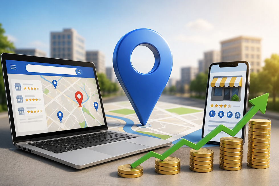
Local SEO and Mobile Optimization in Vizag
For businesses targeting a specific geographic region, like Vizag, mobile optimization goes hand-in-hand with local SEO. Most local searches—like “best coffee shop near me” or “digital marketing company in Vizag”—are made on mobile devices. If your website isn’t mobile-optimized, you risk losing out on this high-intent traffic.
Ensure that your site is listed in Google Business Profile and that your NAP (name, address, phone number) is consistent across all platforms. Embed maps, local schema markup, and client testimonials that reinforce your authority in the Vizag market.
If you’re running paid ads or SEO campaigns focused on digital marketing in Vizag, mobile optimization must be part of your strategy. A slow-loading landing page or poor UX will waste your ad budget and reduce lead quality.
Testing and Continuous Improvement
Mobile optimization isn’t a one-time task. Mobile devices, user expectations, and Google’s algorithms change regularly. That's why continuous testing is crucial.
Run regular audits using Google’s Mobile-Friendly Test or Lighthouse. Check how your site performs on different devices and browsers. Observe how users interact with your site through heatmaps or session recordings.
Gather real feedback from your audience. Are they having trouble finding what they need? Are forms difficult to submit? These insights are far more valuable than any checklist.
Also monitor performance metrics like bounce rate, time on site, pages per session, and mobile conversion rates. Tools like Google Analytics, Search Console, and Hotjar can help track these metrics over time.
Make updates proactively. Refresh your design every couple of years, trim unused plugins or scripts, and stay informed about best practices.
How Leadraft Approaches Mobile Optimization
As a leading digital marketing agency in Vizag, Leadraft focuses on building mobile-first strategies that blend performance, design, and user experience. For us, mobile optimization isn't just about tweaking a site for speed — it's about understanding user behavior, aligning with business goals, and delivering a seamless journey from search to conversion.
We audit websites for mobile responsiveness, page speed, layout efficiency, and performance bottlenecks. We also work with clients to simplify content architecture, streamline navigation, and craft mobile-specific content strategies.
By combining design thinking with technical expertise, Leadraft helps businesses future-proof their websites and stay ahead of Google’s evolving standards.
Mobile Optimization Is Business Optimization
We live in a mobile-first world. Your website isn’t just a digital presence — it’s a platform that interacts with users across devices, channels, and moments. When it fails to perform on mobile, it fails to perform, period.
A fast, responsive, and user-friendly mobile site strengthens brand perception, improves SEO rankings, and boosts engagement. It earns trust, converts visitors, and supports growth — especially in competitive markets like Vizag where digital marketing is rapidly expanding.
By investing in mobile optimization, you’re not just enhancing your website — you’re enhancing your business.
Whether you're doing it in-house or working with a professional digital marketing company in Vizag, mobile optimization should be at the heart of your digital strategy. Focus on real speed, authentic usability, and continuous testing, and your mobile users will reward you with longer visits, higher engagement, and better conversions.